Care/of App Reflections
Limited visibility into health progress led to a reflections experience to help users interpret change over time.
Reflections is designed to help users better understand the connection between their daily vitamin routine and overall well-being by assessing their health goals progress.
Role: Senior Product Designer
Team: Senior Product Manager, Senior iOS Engineer, QA Engineer, Brand Team, Medical Team
Methods: Product Strategy, Feature Prioritization, UX & UI Design, Interaction Design
Duration: 2024 (3 months)
Discovery
Ongoing user research showed that users struggled to understand if their daily vitamins were progressing them toward their health goals. Despite feeling good about taking vitamins to support their health, users had very little feedback from the app to help them understand if their vitamins were making any meaningful impact on their lives, beyond daily vitamin tracking.
The Opportunity
This body of work was designed to strengthen long-term engagement and retention by addressing the uncertainty users were feeling, and helping them gain more awareness of how they were progressing with their broader health goals by taking their daily vitamins.
Role
Led UX strategy and end-to-end product design
Defined the product experience and interaction model
Partnered with Product, Medical, Brand, and Engineering to navigate regulatory constraints
Outcomes
Completion rate per engaged user: 2x
Insights engagement (relative lift): +600%
Framing the Experience
Instead of treating Reflections as a standalone feature, I approached it as the first step toward establishing the foundation for a more personalized insights experience over time. To support that longer-term vision, I focused on three objectives:
Help users better connect their vitamin routines with their health goals
Gather higher-quality user inputs/feedback to share progress on their health journey
Validate whether users would regularly engage with reflective check-ins
Hypothesis: If users can better understand how they’re progressing toward their health goals, they'll be more likely to increase engagement with the product.
Designing For Long-Term Engagement
I wanted to create a system of engagement that could support richer, personalized insights by making users feel supported and in control of their health journeys. Since the experience relied on collecting data from users over time, I considered whether users would regularly engage if the experience felt more like a personal check-in, rather than an intake form. Ultimately, I wanted Reflections to feel interesting, conversational, and encouraging to keep users coming back.
Realtime Constraints
Because Care/of operated as a vitamins and supplements company (not a healthcare or mental health provider), we were limited with the types of personalized health guidance we could provide. This meant the experience couldn't rely on giving users direct interpretations or medical recommendations about their progress. Instead, the challenge became designing a system that remained medically and legally appropriate, while helping users understand their health journeys.
* * *
Balancing Engagement with Data Quality
The final scope of the experience was a lightweight sequence of screens designed to consistently capture comparable data across sessions while still encouraging regular engagement. My early concepts covered a broader range of experiences that included journal entries, more evolved mood tracking experiences, and other open-ended reflection formats tied back to the Insights experience:
These ideas were valuable for exploring the longer-term vision, but I deprioritized anything that introduced too much variability in responses, or made it harder to compare progress over time (like journal-style inputs) in favor of simpler input formats, to start.
Defining the Right Cadence
One of the earliest product decisions was how and where Reflections should fit into the overall app experience. Instead of making the Reflections continuously available, I recommended introducing a weekly prompt to accomplish two things:
Giving users enough time to notice meaningful changes
Creating a consistent habit of reflection
The weekly cadence also created a simple baseline for future experiments around timing, placement, and feature visibility.
Designing for Emotional Engagement
My design hypothesis was that if the first interaction felt more emotionally engaging, then users would be more willing to continue through the questionnaire and return to it over time. Because long-term engagement depended on repeated participation, I designed the opening interaction to feel immersive and engaging enough to funnel users through the Reflections experience.
While a standard questionnaire pattern would have been simpler, more familiar, and faster to implement, I introduced a custom radial slider to create a more expressive interaction model. I try to refrain from custom interaction patters in favor of conventional UI patterns, but in this case, I wanted to test engagement by using the emotional framing of this interaction to generate recurring interest.
Assessing Health Goals
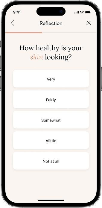
Working closely with Product, Medical, and Brand, we developed a framework that honored the regulatory requirements around health-related language when asking users to assess their health goals.
Through a simple questionnaire, users were able to evaluate their preselected health goals using a Likert scale, which helped to quantify their inputs and allow us to collect richer user data to share back while remaining compliant.
Closing the Feedback Loop
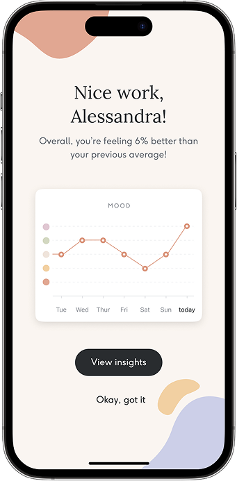
Each completed reflection concluded with a snapshot comparing the user's latest responses with previous entries, helping them visualize their progress over time.
Although integrating richer health insights like deeper scientific feedback remained part of the long-term vision, regulatory constraints and implementation complexity made the decision for simpler feedback experience a solid first step toward the larger vision for a more robust insights experience down the road.
The completion screen was designed to generate encouragement and inspirational messaging in cases where users may not complete a reflection or report doing as positively as the last Reflections entry.
Results
This release supported our hypothesis that helping users better understand their progress toward their health goals would increase engagement with the product:
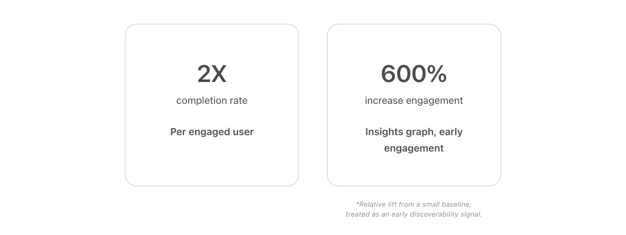
2× increase in completion per engaged user, suggesting users who discovered the feature found enough value to return and complete reflections more frequently.
600% increase in Insights engagement following completion of a Reflection (relative lift from a smaller baseline), suggesting the new flow successfully directed users toward exploring their progress over time.
Users also reported increased self-awareness and motivation after completing a Reflection, suggesting the experience helped make their progress feel more tangible.
Product Learnings
While the feature successfully increased depth of engagement, overall reach was still limited, which highlighted that users who completed Reflections found value in the experience, but broader adoption would depend on improving how and when the feature was surfaced.
Next Steps
Given the engagement trends of this release, the next area of improvement was to maximize reach. The next iteration would focus on increasing adoption by testing feature visibility, placement, and prompting frequency to help more users discover Reflections. With stronger adoption, the long-term vision would be to evolve Reflections into a richer personalized insights experience, using accumulated user feedback to deliver more contextual information on how users’ vitamin routines are impacting their health goals over time.