Care/of App Navigation & IA
A dip in retention prompted a new app framework aligned with users’ mental models for subscription management.
Care/of is a personalized vitamin subscription service. The app allows users to track their vitamin routines, earn rewards for tracking, and manage their subscription.
Role: Senior Product Designer
Team: Product Manager, Head of Product Design, Director of Engineering, iOS Engineer, QA Engineer
Methods: Research Synthesis, Information Architecture, Design Auditing, Usability Testing, UX & UI Design
Duration: 2024 (3 months)
Overview
Earlier in the year, Design leadership and I partnered with Product to conduct generative research as part of several broader retention initiatives in response to declining retention metrics. That research uncovered an opportunity to address a deeper usability issue within the app experience tied to long-term retention.
Identifying the Core Problem
The key takeaway from research was that app navigation, particularly around subscription management, was the largest underlying source of friction for users. While this issue wasn’t completely new to myself or the team, my Product Manager and I analyzed the survey responses in more depth using an LLM workflow to cluster behavioral themes from the research to better understand how this was impacting users’ experience with the service altogether.
Role
Led end-to-end design for Care/of’s global app navigation redesign
Synthesized research insights to define new app information architecture and tab bar design
Partnered with Design Leadership, Product, and Engineering to align the new navigation with business goals and technical constraints.
Outcomes
15-day app retention: +5%
Click to view upcoming orders: +196%
Overall decrease in cancellations
New Tab Bar & IA
* * *
What the Research Was Saying
The survey was sent to 800+ customers to reassess their motivations for using the app, their top pain points, and the gap between the app experience and their expectations.
Users generally liked the app but navigating around it, particularly in relation to managing their monthly orders, was a recurring pain point. Qualitative feedback also reinforced that finding subscription details, locating and modifying orders, and understanding where core features lived made key actions more difficult to complete.
Top 3 Challenges:
Navigation
Performance issues
Price
Top 3 Motivations:
Rewards
Tracking vitamins
Managing subscription
Defining Priorities
Based on these findings, the team and I focused on two opportunities to guide our response to the larger retention goals at the time:
Navigation: if users can more easily find and manage their subscriptions, we can reduce friction around a core product experience and improve retention.
Rewards: if rewards are more accessible, users will be more likely to engage with the rewards program and continue earning points towards discounts.
* * *
I. Surveying the Root Issue
The key observation with the app’s overall architecture came down to the design of two different navigation experiences—a hamburger menu and a primary tab bar. Key destinations and higher-value flows were divided between both navigations, making it confusing for users to easily find and access parts of the app in ways they expected:
Previous Navigation & IA
To pinpoint the misalignment between the app's navigation design, information hierarchy, and core flows with our users' mental models, I mapped the insights against the existing app architecture, which revealed where restructuring the app could improve overall usability and discoverability of high-value tasks, particularly around subscription management.
II. Rethinking a New Navigation Framework
I began by auditing the app’s existing contents and information hierarchy, then overhauling its organization based on users’ top needs and high-value touchpoints. This allowed me to translate users’ behavioral patterns into a simpler scaffolding of the app’s overall structure:
Eliminating the hamburger menu: previously, the hamburger menu functioned as the catch-all account management destination, scattering elements of the core vitamin subscription and orders experience which was foundational to the app experience. I removed the hamburger menu entirely to give subscription-related tasks a dedicated destination, and consolidated the remaining account-level contents (Invite Friends, Text Us, Settings) into new sections within the Profile experience.
New tab bar destinations: I created a new Orders tab and Rewards tab within the thumb-zone of the tab bar, centering the Orders tab to maximize discoverability.
III. Determining Tab Bar Destinations
Ultimately, the new Orders tab and Rewards tab was designed to surface two core domains of the app experience deeply tied to customer retention: subscription management, and the app’s rewards system. The ordering of tabs was designed to follow a logical mental progression:
Tabs 1 & 2 (Track & Rewards): highest-frequency destinations focused on daily habit looping and motivation to the left.
Tabs 3 & 4 (Orders & Shop): focused on managing transactions for subscription plans and vitamin product offerings.
Tab 5 (Profile): account-related utilities.
These changes also led to restructuring the the profile experience, shifting it’s function towards a more account-focused destination. All UI design patterns and interaction design patterns across tab destinations were optimized for consistency to ensure the app experience remained coherent.
* * *
Risk Mitigation & Tradeoffs
When looking at the bigger picture, the main drawback with the structural changes was the impact it would have on returning users. Throughout design reviews, Product and Design leadership and I discussed the immediate risks of altering the app’s global navigational structure, focusing on two core areas:
Learning curve: because users would inevitably take time to adjust to the structural and navigational changes, the likelihood of a usability dip was high. To preempt this, I designed a feature announcement to inform users of the new navigational layout and ease them into the sudden structural shift.
Cancellation visibility: moving the subscription management experience out of the buried hamburger menu, and into the tab bar, naturally made the cancellation flow more visible. While the concerns around risking cancellations were completely valid, the team and I discussed the downsides of using Dark UX to make cancellation difficult.
By keeping the experience transparent, the principle was to retain credibility and maintain trust, leaving the door open to future reactivations (if it came down to that). Ultimately, burying the cancellation option wouldn’t prevent users from leaving, but it would guarantee that they leave frustrated.
In conclusion, after many conversations with the team, investing in the long-term upsides of a more optimal navigation experience for the app helped outweigh the temporary, immediate risks.
Validating the New Global Navigation
To evaluate the new structure and navigation of the app, I conducted an unmoderated user test across 184 participants with task completion rates indicating significant improvement in usability:
Launching the New Navigation Framework
The final design resulted in a new tab bar including 5 tabs with the addition of Orders and Rewards, along with enhancements made to the content organization and UI design across new and existing tabs. A feature announcement sheet modal was implemented to walk users through the big change.
Results
Results following the launch of the app’s new information architecture and navigation design:
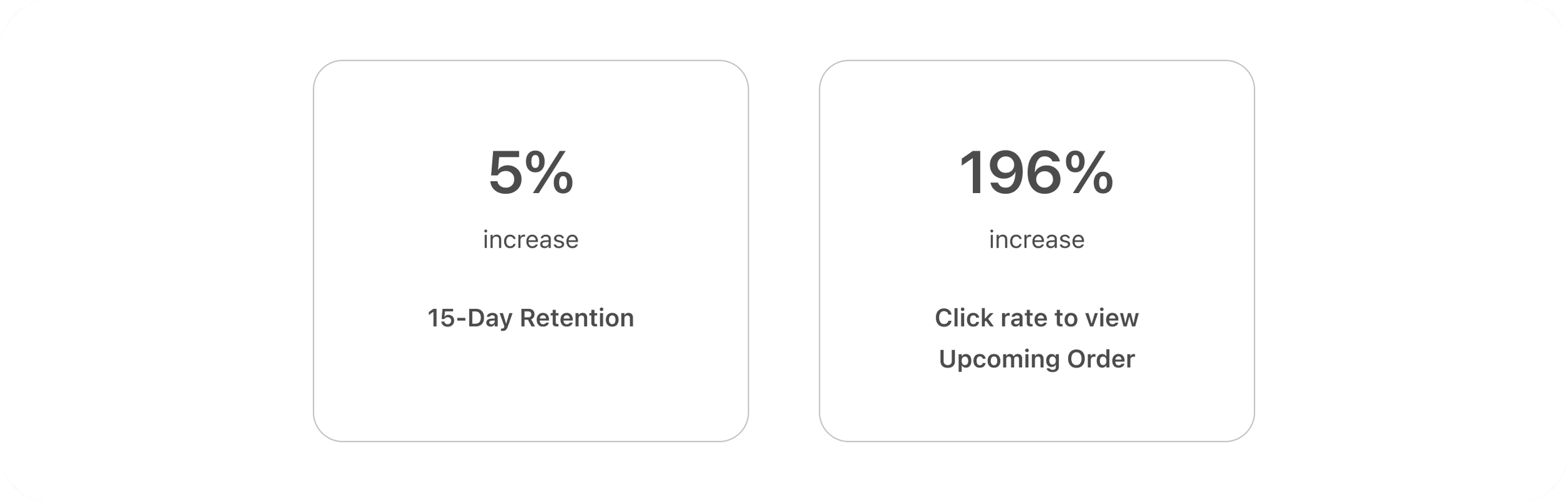
5% increase in 15-day app retention, peaking at 24%—the highest in the previous 8 months—and maintained a steady 3% lift above the previous baseline in the following months. This suggested that while there was an adjustment period for users after the release, the new navigation aligned with users’ mental models on managing subscription orders within the app.
196% increase in taps to view Upcoming Orders, indicating a significant improvement in discoverability as users understood where to find their orders and subscription details within the app’s new structure.
Overall decrease in app cancellation at the time the new navigational changes were released.
Retrospective & Insights
Looking back, the structural changes had much larger user and business implications that required thorough risk assessment, communication, and alignment with the team. This experience ultimately helped staying grounded in an honest understanding of user behaviors and motivations when managing both business and user needs together.
Lastly, from a product perspective, I would have investigated the subscription management experience itself as another solution to the broader navigation issue I was solving for. Incremental improvements to this experience first could have also been a viable path, given that the experience could have delivered more value for the majority of our user base (~75% being returning users). These users had already adapted to the flawed navigation, and broader IA changes may have introduced a longer adjustment period compared to incremental improvements within the subscription management experience.